Customer Background
Our client, the University of Pennsylvania (UPenn), is the oldest institution of higher education in the United States and a haven for academic excellence. It was founded in 1755 and was the first American institution of higher education to be designated as a university in 1779. Today, UPenn is a member of the United States’ elite group of private Ivy League universities.

-
Industry
Education
-
Technologies / Platforms / Frameworks
Node.js, Vue.js, MongoDB, AWS, Apostrophe
Challenges
Prospective and current students, parents, and faculty all visit university websites with a specific goal. With such a diverse audience, university websites must be simple to use so that users can find where to start answering their questions on the university website.
UPenn’s top priority was to improve the website’s user experience and the usability of the university website. We conducted perception and usability tests. During the perception tests, we asked various audiences to reflect on their recent visits to the UPenn site. While for the usability tests, we assisted UPenn in conducting a survey of audience comfort in locating the application deadline and how the website improves staff productivity. The goal was to evaluate the UPenn website’s user experience and attitude to improve its usability.
Various audiences mentioned four reasons for using UPenn’s website:
- Learn more about the university
- Study the course materials
- Look at different programs
- Deliver lessons effectively
The second big challenge was to solve the university site’s findability issues. An overwhelming number of options, images and content contributed to the difficulties with findability. The simple task of finding the admission deadline required at least six clicks and used to take more than a minute to complete. Furthermore, locating specific degree programs and course information took a lot of work.
Additionally, the existing site required staff and university departments to spend a significant time completing any process or submitting purchase requests. Overall, this demonstrated the critical importance of an efficient content management system (CMS).
Solutions
Our developers overhauled the UI/UX, upgraded the website and installed ApostropheCMS. The entire path encompasses many touchpoints. We’ll cover a few here.
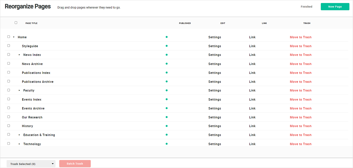
We started by reviewing the website’s navigation structure, content grouping and labeling based on user expectations. We took great care when implementing the CMS to place the piece of content or function where users expected to find it. It was a phenomenal solution to the findability problems.
Next, we created wireframes after assessing the audiences’ onboarding and identifying resource concerns. We organized the wireframes into templates for an efficient workflow and consistency in UX. We created a clickable prototype to test the flow. Implementing this significantly improved user experience, particularly in terms of finding resources.
While transforming the UI system, we created a UI pattern library with appropriate sections (buttons, navigation, icons, etc.) as well as a color and typography style guide. Further, we compiled relevant documentation to expand on specific spacing and text hierarchy rules. The pattern library, style guide and relevant guidance all contributed to a complete transformation of the design system.
The primary goal of the UI/UX modernization, website upgrade and ApostropheCMS implementation was to improve usability and accessibility across the UPenn website. Consequently, it modernized the overall look and feel of the website. From the start, we kept UPenn’s existing branding in the center and transformed systems of reusable and modular components.
Testimonial
Benefits
- Enhanced usability
- Improved findability of resources
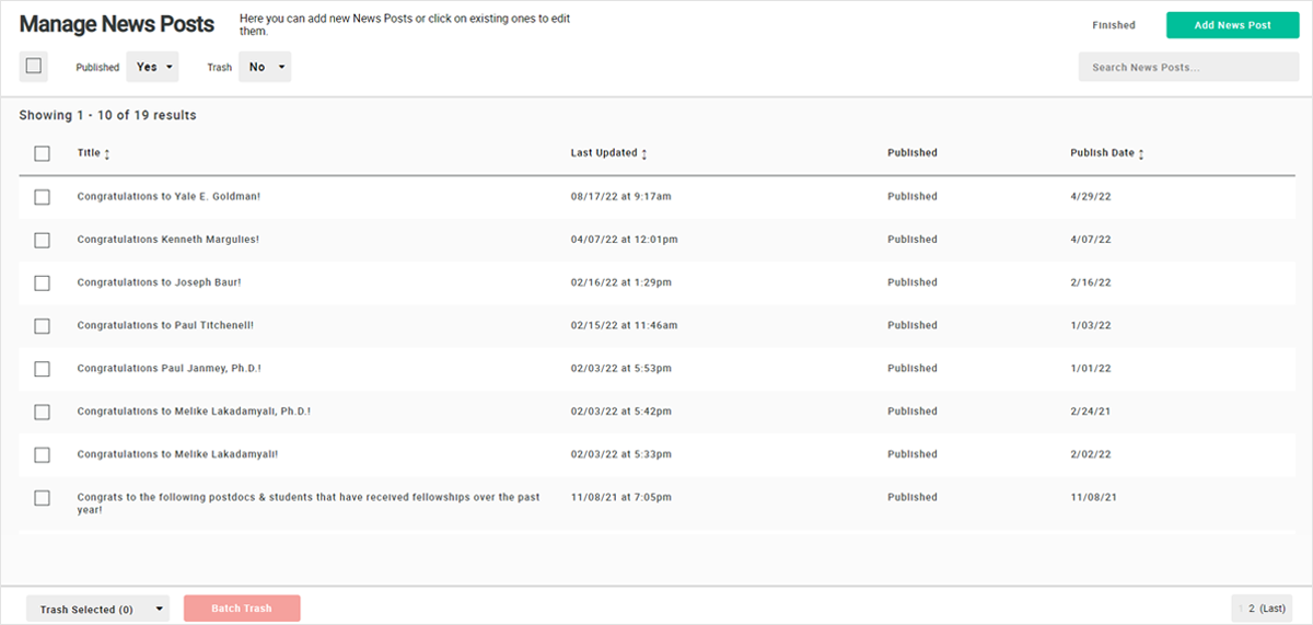
- Logical structure of the content management system
- Smooth navigation backed by effective internal search
- Consistent use of design elements and appropriate page layouts
Need more information?
Tell us what you are looking for and we will get back to you right away!


